
 April 22, 2017 | gcaptain
By Mike Schuler
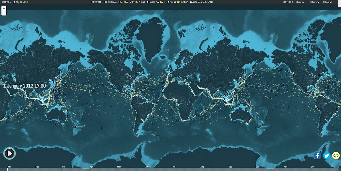
Researchers at UCL Energy Institute together with London-based data visualization and digital journalism studio Kiln have released this amazing interactive map that plots 250 million data points to show the movements of the world’s commercial shipping fleet during the year 2012. (Hit the play button above to learn more about what is being displayed) The map was […]
Created by London-based data visualisation studio Kiln and the UCL Energy Institute

")